What You Need To Know About Color Psychology in Graphic Design
You’ve probably heard the term “color psychology” before. It sounds like a real field of study, but actually, it isn’t. Colors—and their meanings—are subjective.

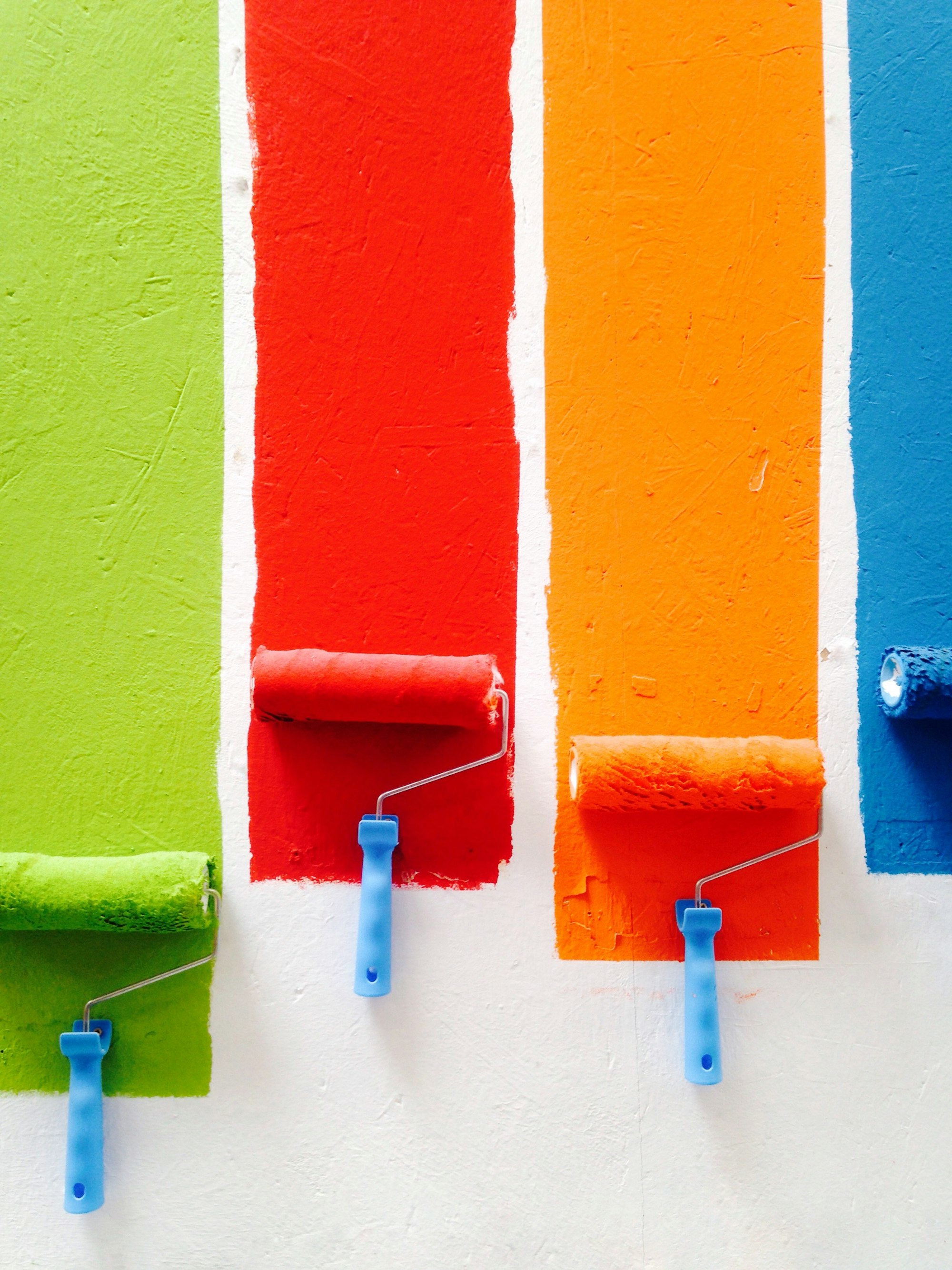
Colors are powerful tools.
It doesn't take a degree in psychology to know that colors are powerful tools. For example, we all know that a red light means “stop” and green means “go.”
But did you know that, without even realizing it, the colors of your brand logo are likely sending strong subconscious signals to potential customers?
In fact, research has shown that color plays a major role in our decision-making processes.
The idea of color psychology has been around since 1880.
You might think that the idea of color psychology is new, but it's actually been around since 1880.
That's when Wilhelm Wundt was conducting studies on how certain colors affect different people. In his book "Principles of Physiological Psychology," he said, "It is a well-known fact that a person's character, as well as his mood, are revealed by the choice of colors which he prefers."
As you might have guessed, it wasn't until around this time that color theory started to become popular in graphic design. From there the field evolved, with Munsell and Itten writing about color theory and Eysenck being one of the first to write about color and personality in the 1950s.
When people say “color psychology,” they’re referring to the idea that colors have the power to evoke certain emotions or feelings—in other words, there’s a connection between colors and moods.
You’ve probably heard the term “color psychology” before. It sounds like a real field of study, but actually, it isn’t.
Colors—and their meanings—are subjective.
For example, in some parts of the world, white is associated with mourning or funerals.
In others, it’s the exact opposite: white is a symbol of new beginnings and fresh starts.
There are also pretty big differences in color perception across cultures (white vs. red wedding dresses come to mind).
In other words, people experience colors differently depending on context and life experiences. That being said, there are some general associations we can make between color and mood that can be helpful when trying to evoke certain emotions through design.
Here are a few examples:
- Green: Relaxing
- Blue: Calming
- Purple: Unconventional (used more often by brands targeting creative audiences)
- Yellow: Cheerful
Color psychology is not a precise science. While there are general theories about how colors can affect people’s moods and behaviors, you need to take these with a grain of salt.
In the end, people are different, so it’s hard to predict how they will react to a specific color in your design.
Also, these theories might not work in every situation.
Finally, remember that color psychology is only one aspect of graphic design—and not the most important one at that.
The success of your brand or product doesn’t depend solely on the colors you use in your designs. You also need to consider other factors like readability and accessibility.
The psychology of color is important in every facet of design, but it’s especially relevant for graphics for marketing and branding.
The colors you choose can have a huge impact on the success of your marketing campaigns.
So, if you want your marketing to be successful, you need to understand the psychology of color.
But there are some basic things we should understand about it before we start choosing colors for our projects:
- Color effects are not universal.
- Color meanings are not universal.
- Color meanings are not static.
Color meaning is not a science.
These four principles might seem like they’d make the application of color psychology in design irrelevant, but it’s actually the opposite—they mean that you have to be more intentional with your design.
Color relationships can be strong or subtle, depending on how you use them.
When it comes to selecting colors, you can either choose colors that are closely related or those on opposite sides of the color wheel. This distinction is important because close relationships can be subtle, while opposites create a more striking contrast.
Colors in the same family are subtle and gentle—they don't command your attention as an opposite color combination would. These relationships include monochromatic (on one side of the wheel), analogous (adjacent on the wheel), and complementary (across from each other).
This is where color relationships come in. The simplest way to think about color relationships is the way that colors are laid out on a color wheel: the contrast between warm and cool, bright and muted, or dark and light.
Color relationships can be strong or subtle. Complementary colors are strong because they're right next to each other on the color wheel (such as red and green). Analogous colors are more subtle because they're sided by side (such as orange and yellow). Strong relationships create bolder looks, which work well for brands with a lot of personality. Subtle relationships create refined looks that work well for sophisticated brands.
When you’re working with a brand or making your own branding decisions, you want to make sure that your colors reflect the emotion you want to evoke in those who see them.
- Choose your colors for the emotion you want to evoke.
You need to know what emotion you want your design to convey before you start picking colors as well. You also need to remember that color is subjective, so certain people may see color differently than others. For example, one person's red might be another's dark pink.
- Use the same colors in every design project for consistency.
If you’re working with clients, make sure they are using the same color palettes for all of their marketing materials and website designs so everything looks consistent. This will help build stronger brand recognition because customers will recognize their logo or website by its color palette rather than by its name alone (which is great since names can sometimes be difficult to remember).
- Make sure your color palette reflects the emotions of your brand or product and create one yourself if it doesn’t already exist!
If there are no existing guidelines in place from previous projects then sit down with someone from marketing/sales and think about what sort of feeling they want their logo/website/etcetera to give off when people see it firsthand – this could lead to some interesting discussions about the psychology around different cultures too which would make things even more interesting! If not then go ahead and make up something new.