How to Use Complementary Colors
Color theory is an incredibly useful tool for creating an interesting and cohesive design. It can help you learn the basics of color, understand how they interact with each other, and even make educated guesses about what colors go well together.

Color theory can be a useful tool in your design projects.
Color theory is an incredibly useful tool for creating an interesting and cohesive design. It can help you learn the basics of color, understand how they interact with each other, and even make educated guesses about what colors go well together.
The basic principle of color theory is that all colors are related to one another somehow. You can't have a red without a green or a blue without an orange, because they're all directly opposite each other on the color wheel. That means if you have one color on your screen it will have some relationship with every other color displayed there.
This can be extremely useful when you're trying to choose which colors work best together in your design project.
Complementary colors are opposite one another on the color wheel.
The colors that are opposite each other on the color wheel are called complementary colors.
Complementary colors, such as red and green, orange and blue, and purple and yellow, are bold and vibrant. That's why they can be found in many logos or other branding materials. Complementary colors play well off of one another because they contrast with one another. If you use a secondary color (green, orange, or purple) as your background color and primary color (red, yellow, or blue) for your text this will make both the background color stand out more than they would if you used a black text instead of a primary color which is what should be used with secondary colors to make the text pop out more brightly on the screen. This is because secondary colors tend towards darker tones while primary ones lean towards lighter tones making them easier to read against whichever background you choose for your page design even if it was yellow!
Under certain circumstances, complementary colors will appear to vibrate when placed next to each other.
If you've ever taken an art class or studied design, chances are you've seen the color wheel. It's just what it sounds like: a circle that tells you which colors are complementary. But where did the color wheel come from? And how do we put it to good use?
The well-known color wheel was first introduced by Sir Isaac Newton, who was studying optics in the 1600s. The "wheel" is circular and divides up the spectrum of visible light into 12 sections (or hues).
Three of these divisions—red, yellow, and blue—are known as the primary colors. If you mix two primaries together in equal quantities (try red and yellow), then you get your secondaries—in this case, orange. Mix all three primaries together and you get white light again. Easy!
In practice, complementary colors can be tricky to work with because they carry so much visual impact. A stark contrast between red and green will draw immediate attention to itself—which is great for an accent wall or piece of furniture but not so great for an entire outfit or room design! For a less jarring effect, try combining analogous colors: those that are side-by-side on the wheel (like blue-green and green).
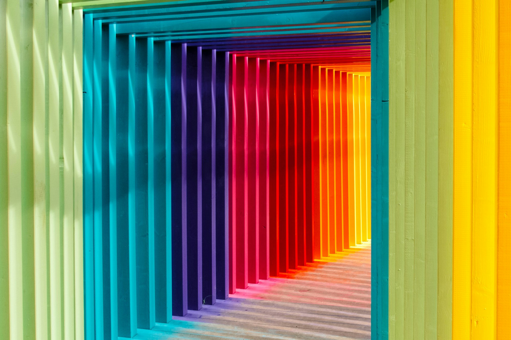
One way to use complementary colors is to create a gradient by using both of the colors you want to pair together at different saturation levels.
One way to use complementary colors is to create a gradient by using both of the colors you want to pair together at different saturation levels.
Oftentimes, the best way to introduce the two complementary colors and make them work together is with a gradient. This type of color composition transitions from one color into another so that it's less abrupt and jarring than two solid blocks of color next to each other. An example would be having one side of your design feature a dark blue, while the other side has a light yellow. This technique also allows for more creative freedom when it comes to designing your piece as you aren't limited by choosing only one color or another.
Another approach is using more saturated versions of both complementary colors in different areas within your design–maybe even overlapping them slightly so they bleed into each other without actually being adjacent (though this can look pretty cool too). A great example would be having bright red text over top yellow background images while keeping everything else around those elements monochromatic (like some simple black text). The contrast between these two complementary hues is what gives this combination its pop!
For example, a bright green and bright red are considered complementary, but a faded orange and faded blue are also complementary.
Complementary colors are any two colors that are directly opposite each other on the color wheel, so they appear to be in contrast and produce a great visual tension. They are sometimes called “opposite” colors because of this and their complementing nature. Complementary colors often make appealing color combinations, such as red and green, orange and blue, or yellow and purple.
When you place complementary colors next to each other, they almost seem to vibrate due to the intensity of their opposition. To use complementary colors effectively in your design work, try placing one color in the background, like your webpage or document background color for example, then place certain elements of text or images against it using the contrasting color.
Complementary colors can be used as accents for each other instead of as the dominant color in your project.
You can use complementary colors as accents for each other. In this example, red is used as the dominating color, and green and purple are used as accent colors.
You can even use just one of the complementary colors as an accent in your design.
Creating contrast with complementary colors is also a great way to add emphasis to certain elements of your design that you want to be noticed first by viewers. You may also choose to emphasize both your grayscale image and complementary color by creating a focal point in which both are combined and brought out equally through color contrast.