A Simple Guide to Understand Contrasting Colors in Graphic Design
Want to learn how to use contrasting colors in your designs? This post tells you all you need to know.

I've been asked many times if there are any rules to using contrasting colors. This is a simple breakdown to help you understand how to use it.
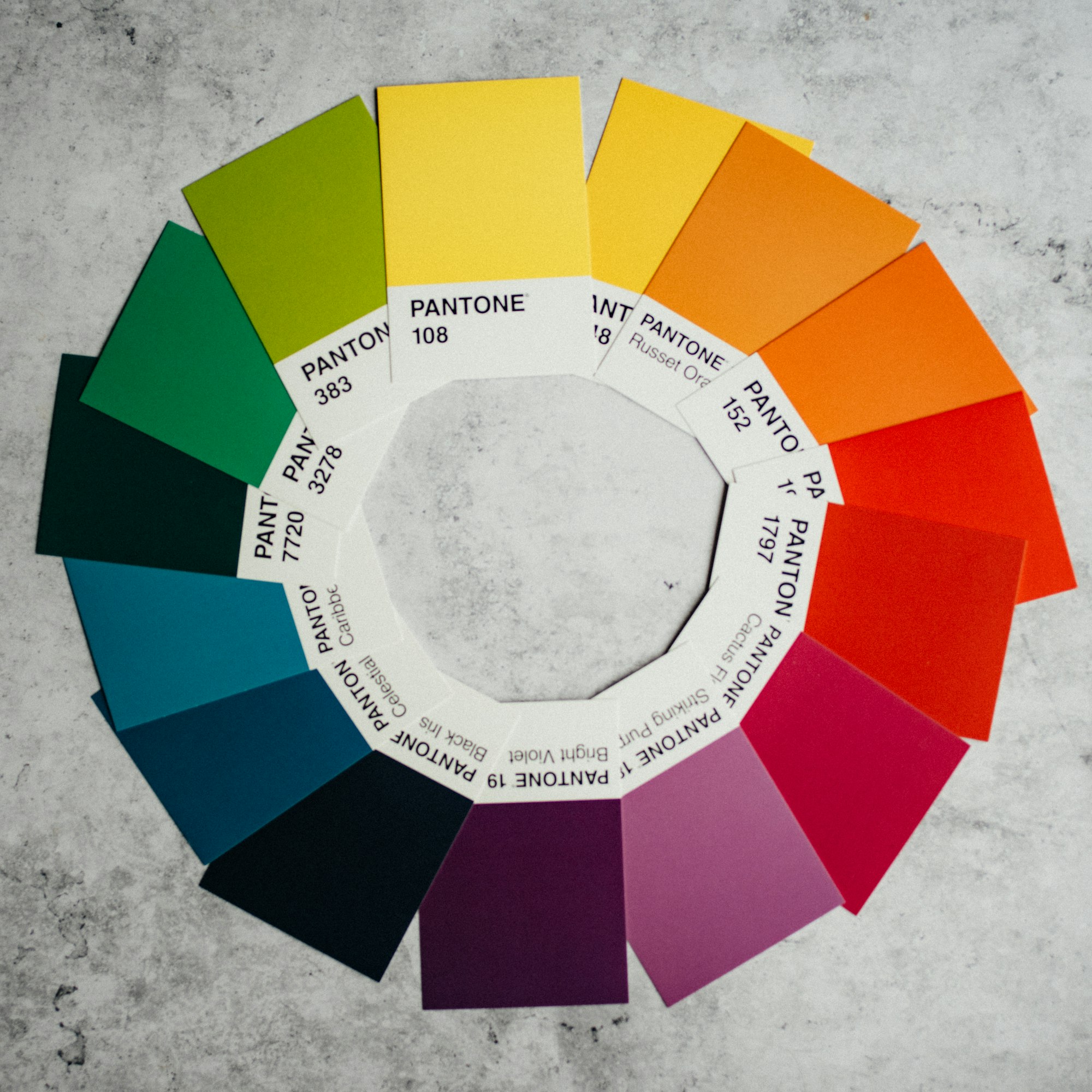
Color Wheel & Color Theory

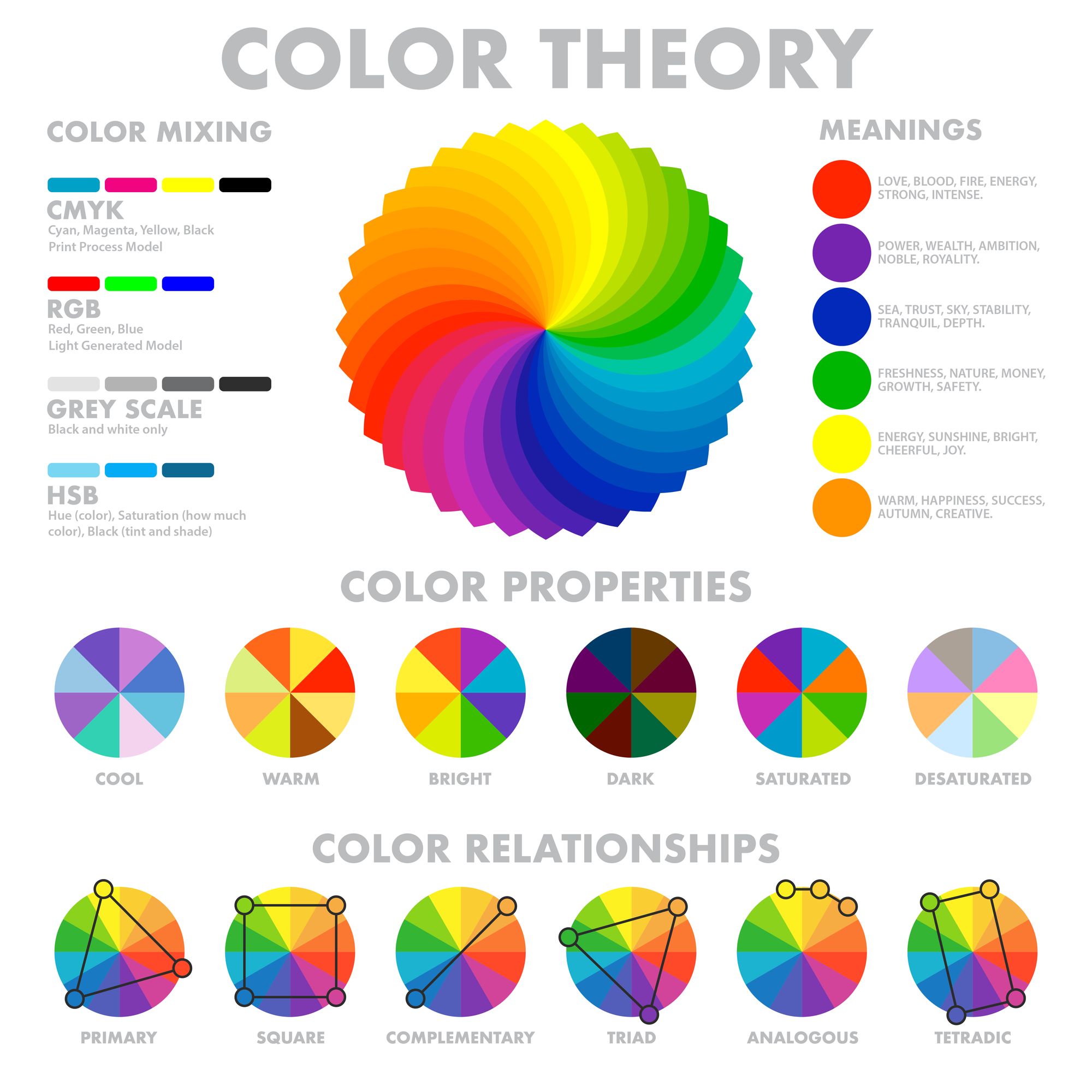
Complementary colors are those that lie directly opposite one another on the color wheel. For example, red-orange is complementary to blue-green. A great way to create contrast on a design is by pairing complementary colors.
Analogous colors are those that lie next to one another on the color wheel. They share similar properties and create a more cohesive design than complementary colors can achieve alone.
Take an analogous color scheme, like green and blue, for example, they come together in the same way that a forest of evergreen trees might, but they never quite touch or overlap. This contrast creates visual interest while still maintaining harmony within your layout.
Anchor
In a good color scheme, you want to make sure that you've got at least some contrast. The reason for this is that contrast helps you to emphasize your design elements and make the page look interesting. Without contrast, it's difficult to set a mood or even to tell your story.
The way that you get contrast is by using contrasting colors. In graphic design, color can be described as either warm or cold, though of course there are no actual temperatures associated with these words, it's more a matter of hue, tone, and intensity.
Warm colors include reds, oranges, and yellows; cold colors include blues, greens, and purples (yes "purple" is one of the primary colors -- so are cyan and magenta).
Colors from opposite sides of the wheel have the most difference between them; these are called complementary colors. Other rules about contrasting colors involve how saturated they are: it's usually best if there's at least one dark color on your page and at least one light color on your page.
Contrasting colors
Good contrasting color combinations:
- Black and White
- Red and green
- Blue and orange
To choose good contrasting colors, you should consider the level of contrast between two colors. It's important to decide whether the contrast between your colors will be high or low.
If you want a high contrast look, choose bright, saturated colors. If you prefer a subtle look, try lighter or pastel shades of your favorite colors. You can also pair bright colors with duller ones for a medium level of contrast.
Try to avoid choosing similar shades of the same color unless it is intentional (for example, wearing different shades of gray).
Colors that go together
Red and green, blue and yellow, orange and blue, or purple and yellow are two contrasting color combinations that work well together.
Keep in mind that the brightness of a color can impact its contrast with another. For example, a lighter shade of red will have more contrast with a dark green than a dark red will have with the same green.
