What Your Soccer Logo Needs To Have
If you're a soccer team in need of some branding, your focus should be simple. You want a logo that's instantly recognizable and reflective of the pride and spirit of your team. If you're not sure where to start on your soccer logo, check out these tips

If you're a soccer team in need of some branding, your focus should be simple.
You want a logo that's instantly recognizable and reflective of the pride and spirit of your team.
If you're not sure where to start on your soccer logo, check out these tips for what every great soccer logo needs:
Simplicity
Simplicity is key. Your logo should be simple and easy to reproduce. A logo that is too cluttered will appear confusing and difficult to understand, in which case it won't be easily identifiable by fans or the general public.
A good way to test this out is imagining how you would draw it from memory: if you struggle thinking of what the logo looks like, then chances are others will too!
Your logo should be meaningful to your team and its fans. If it's easy for you to understand, it will also be easy for them. That's a win-win situation!
No one wants to struggle with their team logo. It should be easy to read when printed on a t-shirt or jersey with lots of other logos, or on the side of a bus with other advertising copy on it. A simple font works best here; nothing too fancy or intricate that might get lost in translation (or not translated).
As long as your soccer club is represented clearly, who cares what typeface you use? Just make sure it looks good and doesn't distract from the image itself!
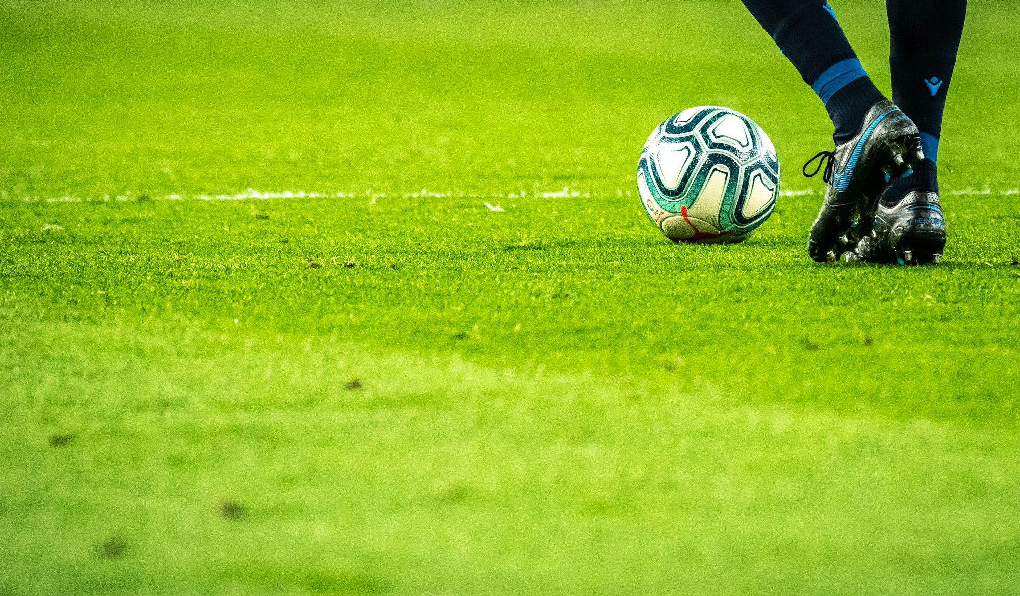
Soccer-related elements
- Include a soccer ball in your logo. This can be done by placing it on top of the lettering or by adding a soccer ball to the design itself.
- Add in a player. This is one of the most important things you can do for your logo because it shows that you are representing not just your team but also all of the people who play soccer across different levels and ages. It also makes clear that this is an international sport, which is great because many people don’t realize how diverse it can be!
- Show off your field with some grass and goal posts—or even just their silhouettes if space isn’t an issue! The more detail there is in these elements, the better; having them look realistic will help draw in fans who know what they should look like based on their experience watching matches on TV or playing themselves at home/local parks/gyms/etcetera (if they aren't already familiar with this game).
Your team's mascot
Your team’s mascot is a symbol of your organization, so it needs to be unique and engaging. It can be a person, an animal or even an object. As long as it’s fun and recognizable, it will work well for you.
For example, the San Antonio Spurs have “The Coyote” who rode a tricycle onto the court during games in 2015. The Atlanta Braves introduced “Freddie T-Rex Jr.," who was his son during this summer's baseball season (and apparently took requests). And when the Philadelphia 76ers were on their way to winning the first overall pick in last year's NBA Draft lottery, they unveiled their new mascot—a giant bobblehead named "Honey Nut Cheerios"—to represent what success might look like for them next season.
Key design features to avoid
For the love of all that's good, please don't use people in your logo. It's a bit of an obvious one, but we've seen it happen so many times that it bears repeating. Images of people tend to be clunky and awkward—a poor fit for the fluidity required for an effective soccer design.
The same goes for animals, buildings, weapons (guns/knives), flags (the Stars and Stripes), religious symbols (crosses or crescents) and political symbols (the hammer-and-sickle). Sports equipment isn't generally recommended either—soccer is not a sport where you can swing something around wildly while shouting "GOOOOOOOOOAL!" at the top of your lungs! Musical instruments are beyond frowned upon—it's just not appropriate within this context.
A professionally designed logo is crucial for your soccer team.
A professionally designed logo is crucial for your soccer team. It’s the face of your club and will be seen by thousands of people on a daily basis. As such, it needs to be designed well so that it looks good when it’s printed on clothing or around the stadium, as well as appearing on TV and in any other medium.
As such, we have put together this guide on what makes a great soccer logo with ideas for how you can improve yours.
A soccer logo should be simple and meaningful.
A simple logo is much easier to remember, which means that it’s easier for people to recognize you on the field or court. It also makes sense that a simpler design would be easier to reproduce on merchandise like t-shirts, hats and jackets. Additionally, a simple soccer logo can be reproduced easily on uniforms and websites because there are fewer elements involved in the design. The same goes for social media profiles: You don’t want your followers scrolling past your page because they get lost in trying to find where everything is located!
Conclusion
So to summarize, your soccer logo should be simple and meaningful. Soccer logos are only meant to communicate the most basic information about your team, so you don't need a complicated design. Avoid using too many colors or adding non-soccer elements to your logo. Instead, focus on using symbols that will make your logo meaningful for yourself and other soccer fans!