What is Visual Hierarchy in Graphic Design?
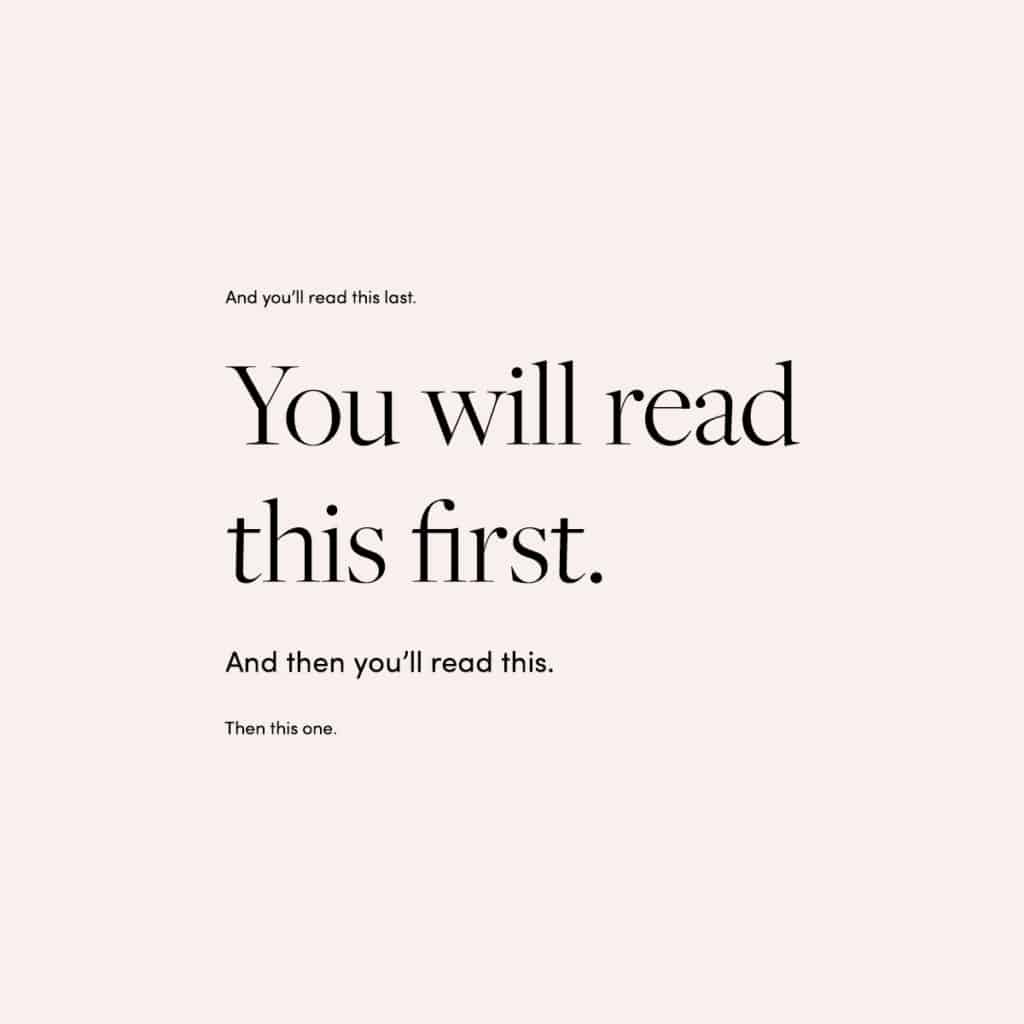
Visual hierarchy is the process of arranging design elements so that the most important ones stand out and the least important ones recede.

Visual hierarchy is the process of arranging design elements so that the most important ones stand out and the least important ones recede.
Visual hierarchy is what allows the human eye to perceive what it sees in a specific order. It's how you communicate which parts of your design are most important.
The first element of visual hierarchy is contrast. We can contrast elements by using size, placement, color, and more. Contrasting elements attract the eye and make them stand out from the rest of your page or screen. This is how we lead the eye to focus on one part of a design before anything else.
The second element is repetition. Repeating an element like a color or image throughout a design creates unity and makes that item feel important through familiarity. Repetition leads a visitor's gaze to follow several different parts of a design at once, creating balance between areas with high contrast and low contrast elements.
Definition
It’s when the visual element of a design is arranged in order of importance. It’s the entire point behind creating “flow” and organization in your designs. Sometimes, your users don't know what they want, so you show them.
And this doesn’t just apply to websites and mobile applications. It's also used in everything from soft drink cans to grocery stores and menus.
So how exactly do we achieve visual hierarchy?
Size
Size: Size is one of the most important ways to create visual hierarchy. The size of a design element can be used in many ways to create visual hierarchy, and it is often used in combination with other visual hierarchy techniques.
One way to use size to create visual hierarchy is to use scale, meaning the size of an element, to draw attention to the most important elements on a page or screen. If you think about marketing materials you’ve seen, this strategy might sound familiar; it’s often used for headlines and calls-to-action (CTAs). For example, a headline may be set at four times the font size of body copy and centered on the page. Call-to-actions are usually placed prominently on web pages for this very reason — so that users can easily figure out what action they should take next.
Color
- Color is an important part of visual hierarchy.
- Color grabs our attention, it provides a sense of importance.
- The best way to use color is to use a color that is similar to the background to highlight the important text.
Contrast
The most basic form of contrast is the use of different colors.
If you have an object on a dark background, it’s going to stand out more than if it were on a light background. The same goes for fonts: something small will be hard to read if paired with elements that are large and bold.
In terms of design, there also needs to be contrast between the important parts of your layout and the less important ones (also known as negative space). For example, when text or images are laid out on a page in such a way that they form shapes (like triangles) or lines (like arrows), viewers will notice them right away. It’s because we are wired for pattern recognition—and these patterns draw our attention away from other things that may not be as visually stimulating. To make sure you don’t confuse your audience with unimportant elements, ensure that every piece has its own unique section where it stands out from everything else around it by using different shapes and sizes to help guide readers' eyes toward what matters most in your message.
Emphasis
As I mentioned earlier, the most important elements should look the most different. If your headline is more important than your body text, it makes sense to make it bigger or give it a different color. If you want to draw attention to a specific element, use a color that stands out against the rest of your design.
Space
- When dealing with multiple elements in a composition, you can use space to separate them, group them or give depth to an image.
- Space is the distance between and around objects. The amount of space you leave between and around objects will increase their visual weight. For example, if you have a row of three circles and there is more space around the circles than between them, they will appear heavier than if there was more space between them than around them.